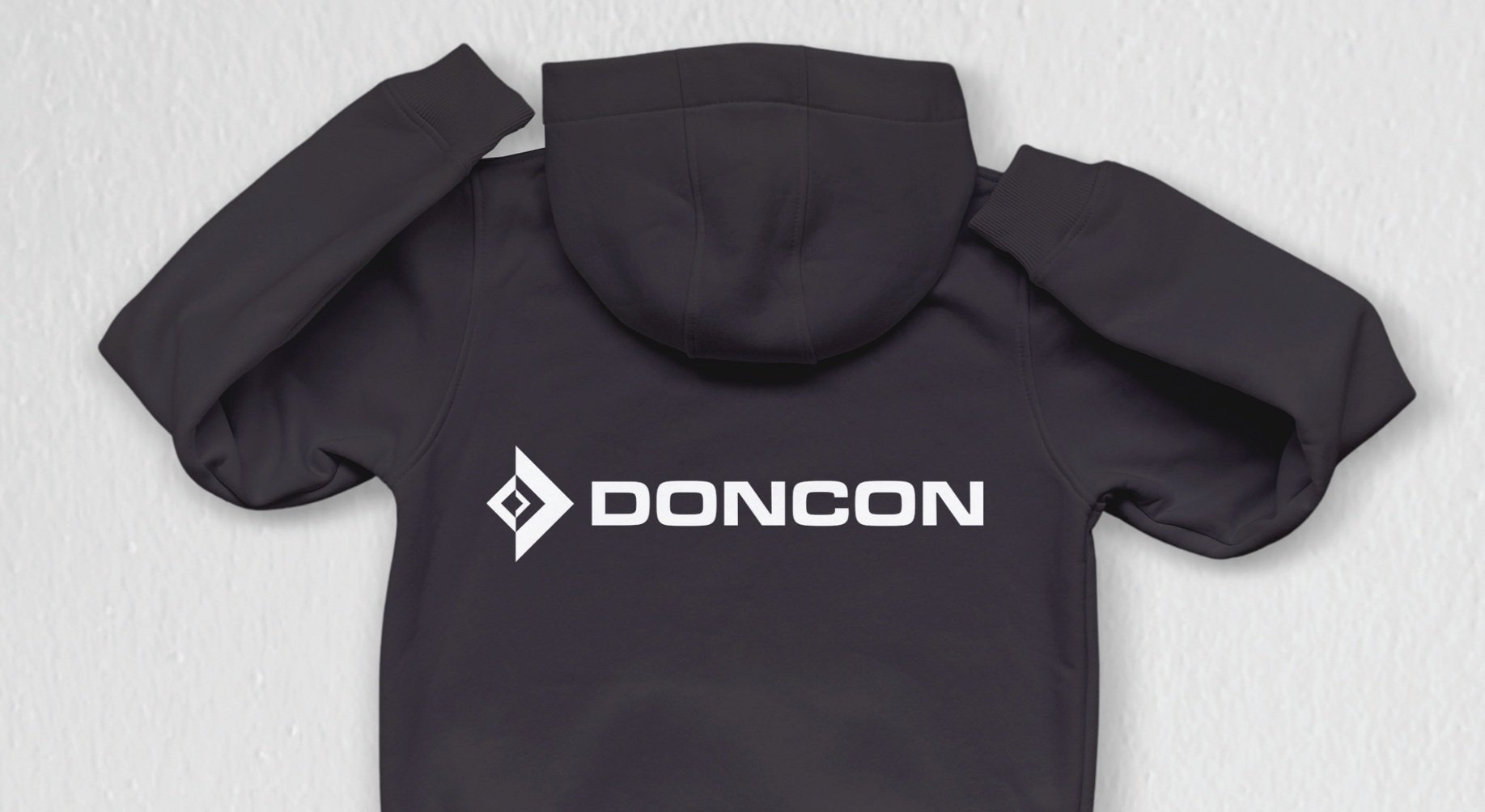
DonCon Branding and Guidelines
The DonCon logo draws inspiration from square parachute systems, known for their use in precision high-altitude supply drops.
This subtle yet intentional reference underscores DonCon’s commitment to accuracy and reliability. The design emphasizes clarity by establishing ample negative space around the logo, preventing visual clutter and preserving its integrity. This approach reinforces the brand’s dedication to meticulous planning and execution in critical operations.
For typography, I selected Archopada, a typeface that combines modern humanist elements with clean geometric lines. This typeface conveys professionalism and reliability, essential traits for a defense-oriented brand. A hierarchy of font sizes and weights was applied to establish clear information structure across various content types, ensuring clarity and impact.
The brand’s color palette features deep blues and subtle greens—coined as Benthic and Petrichor—reflecting themes of depth, innovation, and nature’s resilience. Paired with Dry Slate as the neutral tone, this cohesive palette conveys professionalism while allowing flexibility in design applications.
Imagery plays a crucial role in communicating DonCon’s values of precision and innovation. The image system favors aerial shots, macro textures, and high-tech visuals, reinforcing the company’s focus on strategic depth.
Sample layouts were also created to show how the various elements could play together.


