Asurion Connected Home White Paper
This white paper design focuses on creating a clear and cohesive narrative that aligns with Asurion's mission to bridge the gap in the evolving landscape of connected home technology. The goal was to strike a balance between informative content and visual clarity, ensuring readers stay engaged while easily navigating complex topics. The use of clean, structured layouts with consistent typography and strategic color choices helps guide the reader through each section, enhancing readability and reinforcing key messages.
Download Email
Concepting and Layout
The design for this project highlights Asurion’s leadership in tech support by balancing professionalism and accessibility. A palette of grey tones with subtle highlighter yellow and purple conveys both academic rigor and creativity, while the typography maintains authority and approachability. Prioritizing clarity and user experience, the final white paper is polished and visually compelling, reinforcing Asurion’s brand values of innovation, reliability, and expertise.
Callouts are essential to making complex data more appealing and digestible. The Asurion White Paper uses callouts like these on every spread to make sure readers get at least one piece of valuable information, drawing them in to discover more.
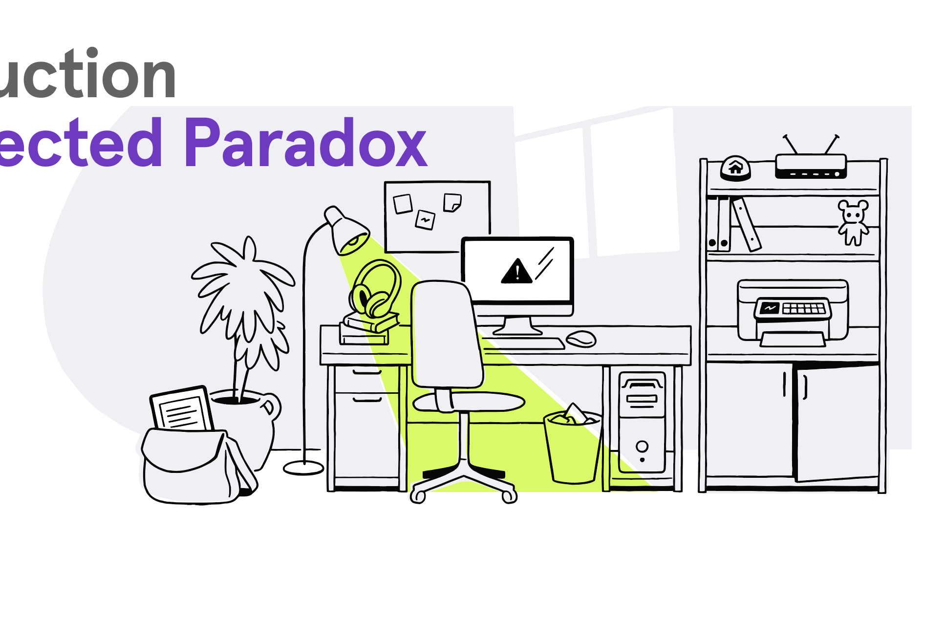
Leveraging Asurion’s vast library of illustrations and their “highlighter yellow” brand color, I created customized art that expressed the trials and benefits of technology in daily life.
Despite Asurion’s abundant library of illustrations it was essential to pull from various individual pieces to create collages that better expressed the message across several portions of the White Paper.


